
New BF Cafe Logo
In 2004, Angel Aviles and Pablo were coworkers in a manufacture’s multimedia department, where they created numerous video, animation and interactive projects, referred to as new media.
In 2005, they wanted to bring their knowledge to the next level. They set out to create a web site for the Latino community, and incorporate new media into the site. The first thing they needed was a name, a brand. Bullfighter’s Cafe was born.
Bullfighter’s Cafe would be a place where Latino artists, filmmakers and performers would be interviewed and promoted. The name fit. Latino creatives had to fight the metaphorical bull for their art.

The first iteration of the logo was focused on the bull but, it was quickly decided that the focus should be on the bullfighter, the artist.
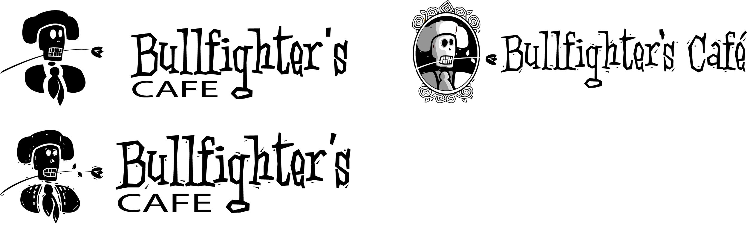
In 2008, the bullfighter went through refinements as the web site and concept grew from a learning experience to a working, and recognized site.

“Bullfighter’s Cafe” text was also shortened for both graphical and animal cruelty association considerations. Angel suggested that “BF” could easily be read as “Best Friend” as well.
From 2010 until 2020, BF Cafe was dormant. Life happens. Angel had long left the project and Pablo was unable to dedicate deserving time to the site, but he never gave up on the vision for BF Cafe. No longer a web site that would showcase artists, Pablo looked to revive the cafe and change it’s focus.
Pablo still aimed to highlight Latino culture through the arts, but on a personal level. After attending several Dia De Los Meurtos (Day of the Dead) events, and seeing the enthusiasm from a diverse crowd of people, Pablo decided to make the celebration the cornerstone of the web site. Through Day of the Dead, Pablo felt he could use the celebration as a means to introduce and promote Latino culture. As a result the bullfighter logo was simplified further.

However, Pablo was never satisfied with the white washed calavera (Skull). It was temporary logo until BF Cafe could be properly branded.
In 2022, Pablo lost his father unexpectedly. He had already lost his job, finances and plans of relaunching BF Cafe due to the results of the pandemic. A year later, Pablo moved back with his mother to assist her with daily life.
With his life completely changed, Pablo still believed in his dream of BF Cafe. He felt its potential was still possible and required.
In 2004, Pablo returned to BF Cafe and working late into the evenings, he set out to bring life back into the cafe and developed a new plan with the help from his brother. The first step, create and reintroduce the cafe’s brand.
After numerous attempts to design the right calavera with tranditional Dia de los Muertos designs, Pablo felt his logo treatments were common, without merit.
Pablo looked deeper into the history of Dia De Los Meurtos and the mythology of the Aztecs and Myans. He quickly researched the stories of Mictlantecuhtli and Cizin. On seeing images of Mictlantecuhtli, it was a eureka moment for Pablo. Mictlantecuhtli is the Aztec God of the underground. The direction for a new logo was an obvious given, it would be a fusion of historical and contemporary values, traditional and modern aesthetics and most importantly, rich with story.
Utilizing the images of the carvings of Mictlantecuhtli, Pablo incorporated flowers to represent Dia de los Meurtos, and included an image of a tree of life. The crown resembled the tics of time or the rays of sun light, while the flower clinched in the logos teeth (a motif carried over from previous logos), lays in its final resting place.
Pablo hopes the new logo will be inspirational and an embodiment of Latino culture.
